


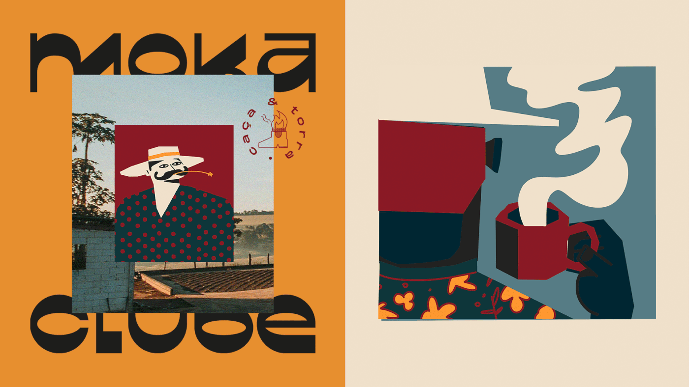
Desenhamos uma marca de cafés especiais com um pé no campo e outro na cidade.
Diariamente nos confrontamos com a pergunta: quem faz os produtos que consumimos? A primeira refeição do dia é a mais importante, e começar a jornada sem café é como ligar um carro sem combustível.
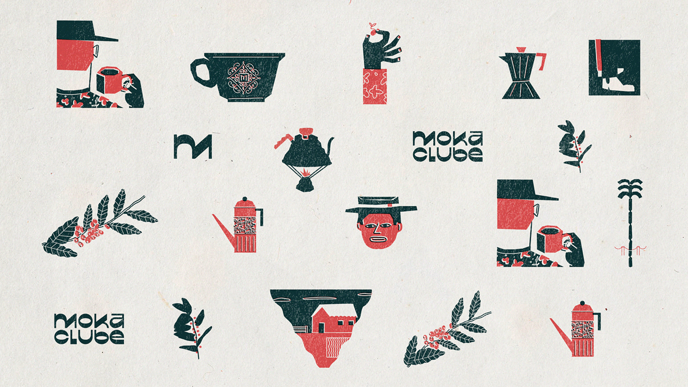
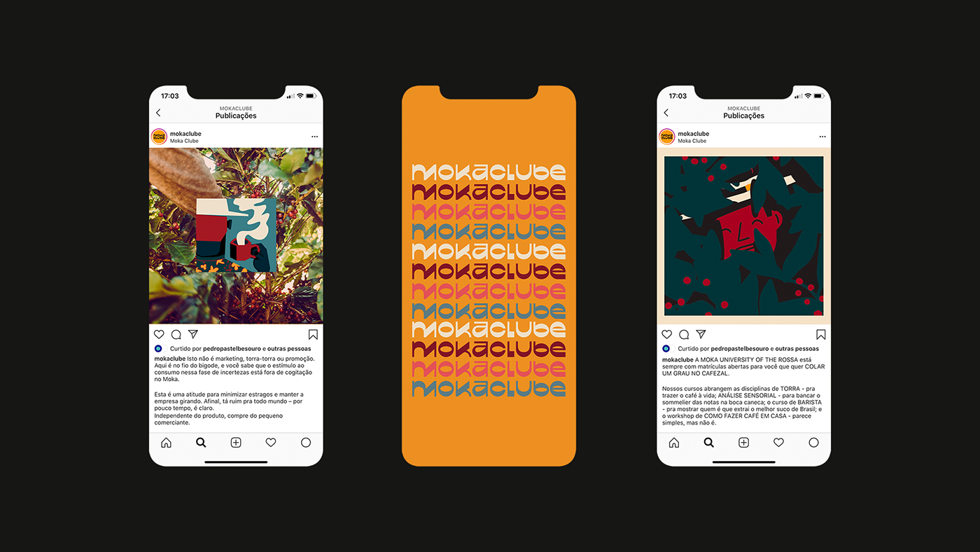
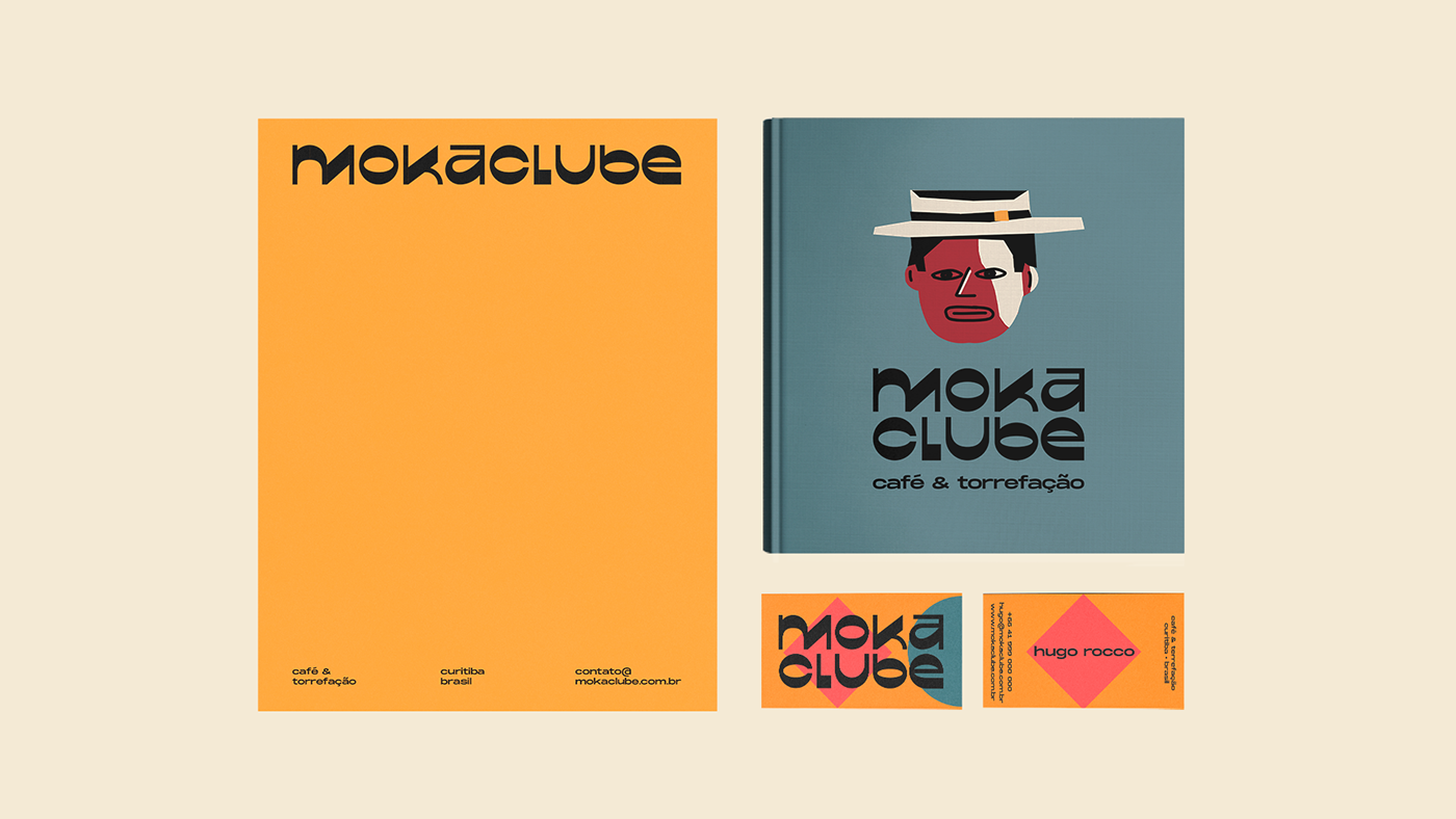
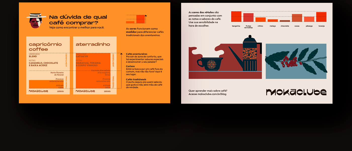
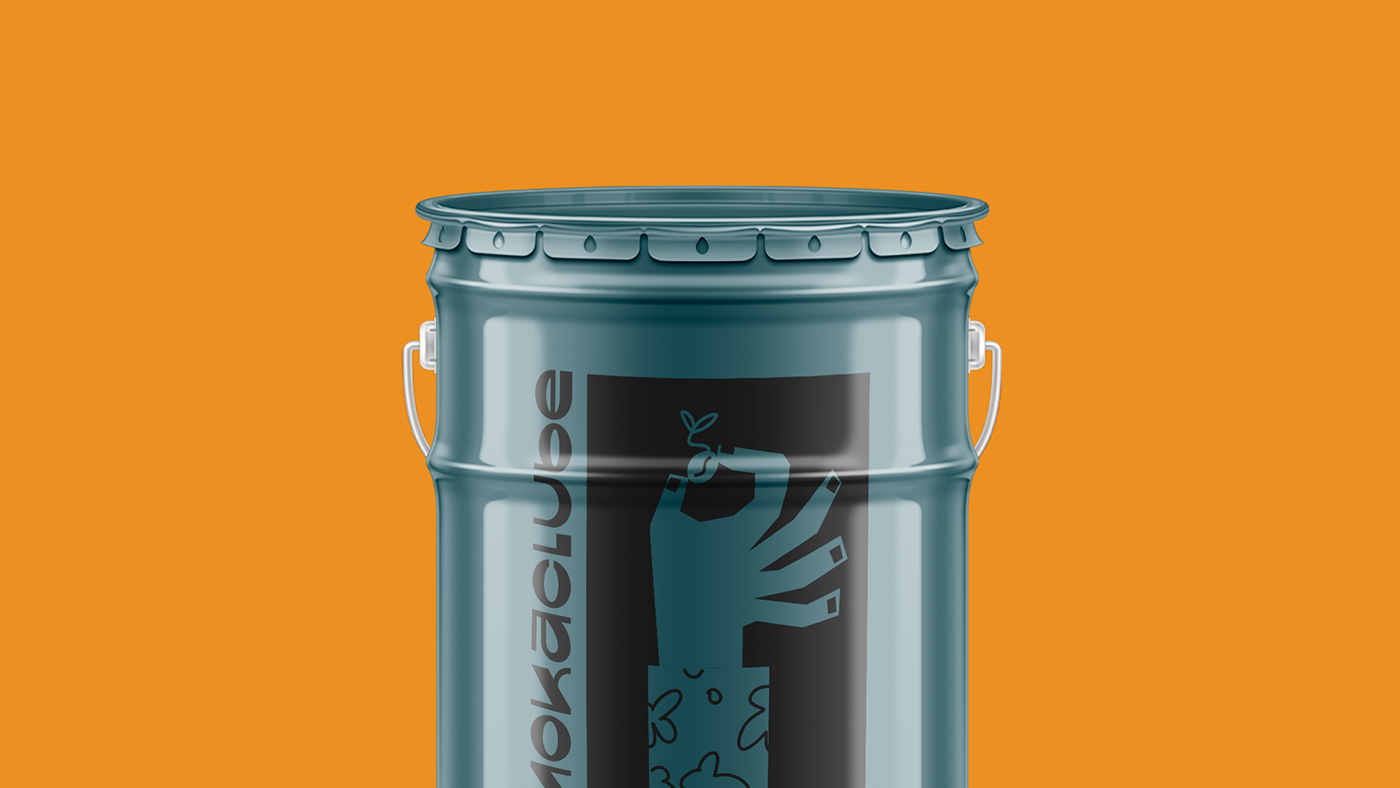
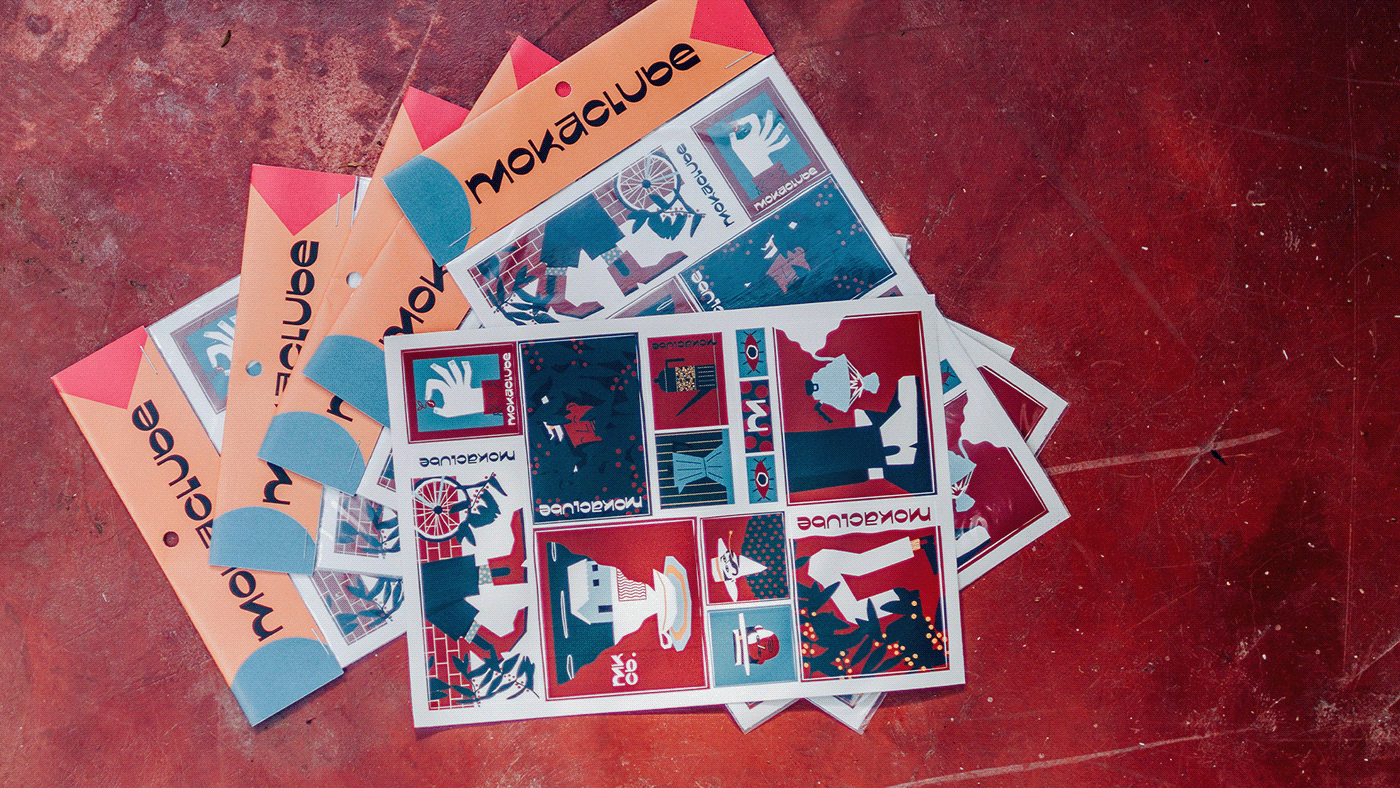
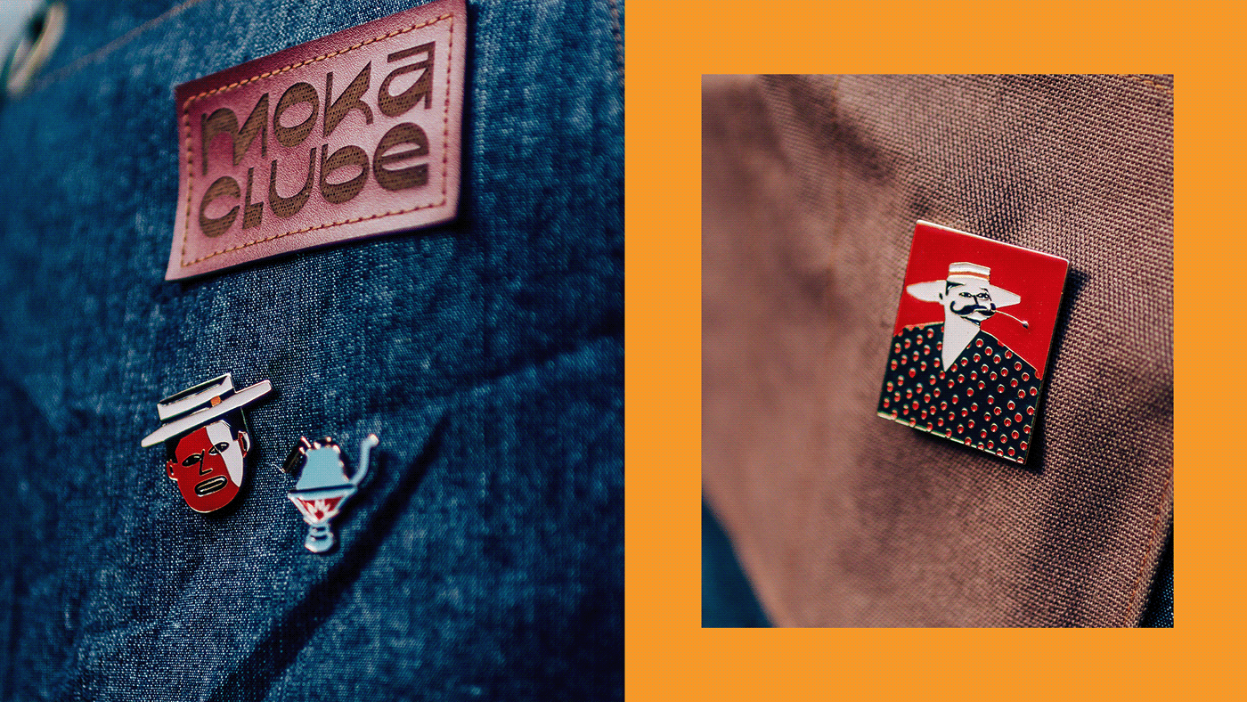
Pioneiros em clube de assinatura de cafés brasileiros, nosso trabalho com a torrefação Moka Clube envolveu estrutura de marca e compreensão de cada vertente de seu negócio, identidade visual e elementos de marca, além de ilustrações exclusivas e desdobramentos, design de embalagem, selos, rótulos e sinalização.
Com um conceito que mescla ambientes urbanos e rurais, captamos a essência das fazendas e galpões onde são colhidos, secados e armazenados os cafés e contrastamos com elementos cosmopolitas da torrefação.
A fonte modernista criada para a marca evidencia esse contraste entre organicidade e geometria e faz menção às utilizadas na indústria do café do início do século XX.
Madeira, terra, metal, fogo e água - trouxemos, nas ilustrações, alusões aos elementos e ao estilo de vida da fazenda, aos processos de preparo do café e ao cenário nacional para compor uma cartela que expressa a verídica arte de fazer café.
We designed an urban brand with a countryside essence.
Who makes the products that we consume? That is a frequently asked question. Breakfast is the most important meal of the day and starting the routine without coffee is like turning on the engine of a car without any fuel in the tank.
Pioneers of Brazilian coffee subscription, Moka Clube roasters asked us to develop their brand new visual identity. The work that involved branding illustration and applications, packaging design, stamps, labels, and way-finding was delivered within the understanding of their business structure, branches, and positioning
Mixing urban and countryside elements in a concept, we've captured the rural essence of the farms and sheds where the coffee is harvested, washed, dried and stored and contrasted with the cosmopolitan elements of their headquarters, where it is finally roasted.
The modern font especially created for the brand contrasts organicity and geometry and displays elements used in the coffee industry branding of the 20th-century beginning. Wood, dirt, metal, fire, and water - the illustrations allude to those elements present in the countryside lifestyle, to the national scene and to the process that the coffee is put through, composing an illustration pack that expresses the true art of coffee making.


Client: MokaClube. Creative Direction: Eduardo Rosa & Gustavo Caboco. Concept Argument: Pedro, Pastel & Besouro. Creative Management: Rafael Ancara. Logo Design: Eduardo Rosa. Information Design: Rafael Ancara. Design: Dora Suh, Eduardo Rosa, Felipe Lui, Fernanda Corrêa & Gustavo Caboco. Packaging Design: Dora Suh, Eduardo Rosa. Illustration: Gustavo Caboco. Photography: Diego Cagnato. Account Management: Fernanda Corrêa & Lucia Angélica.


